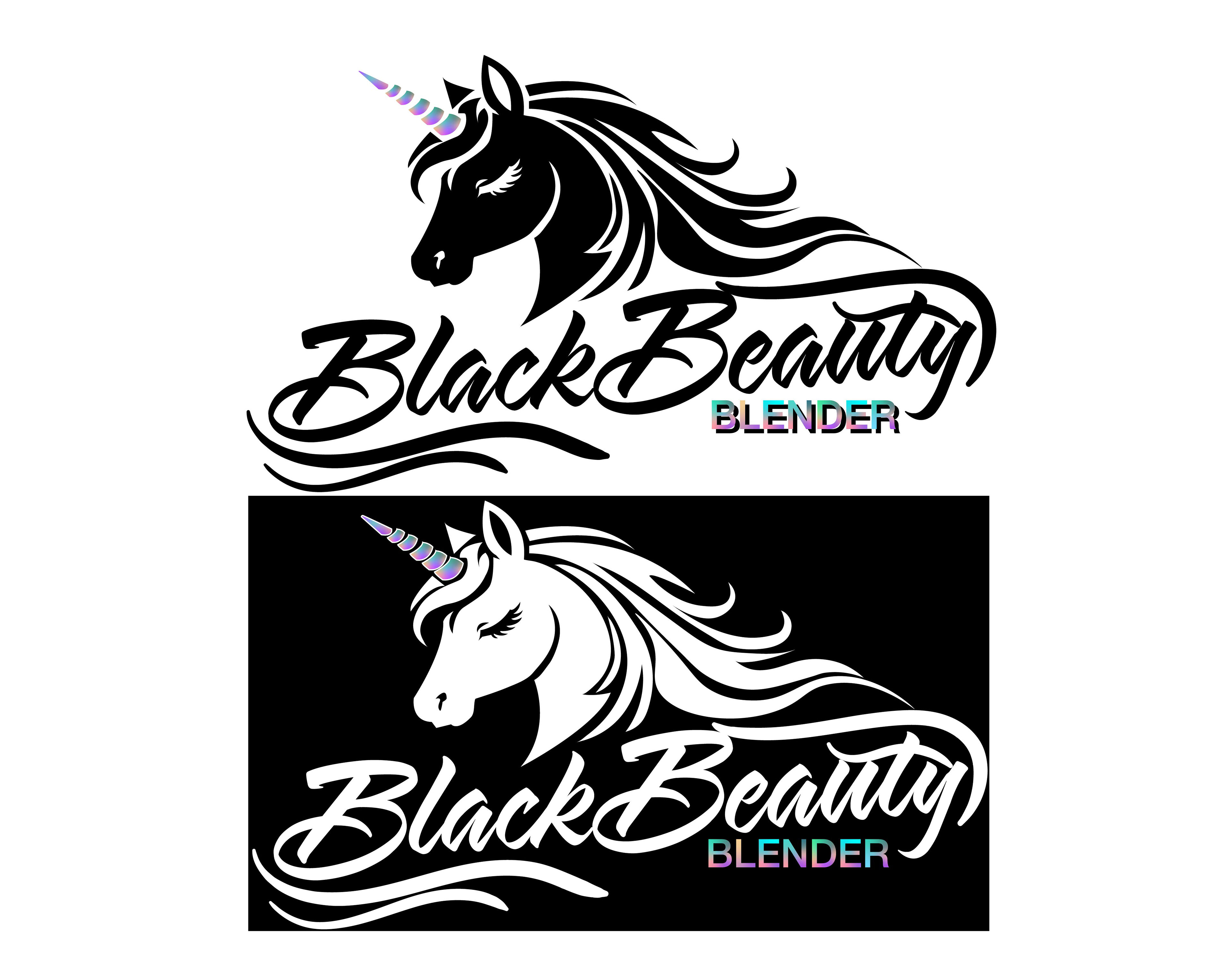
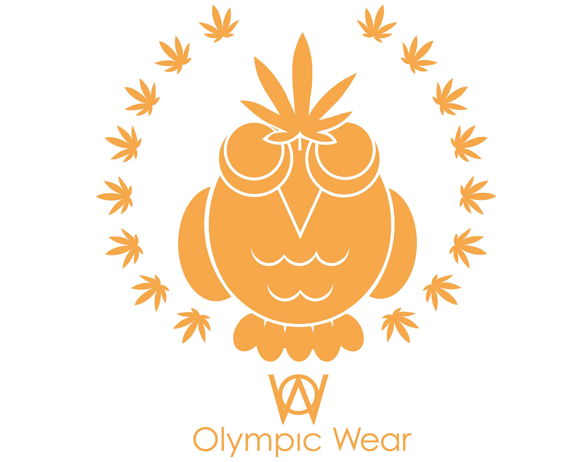
Olympic Wear Logo
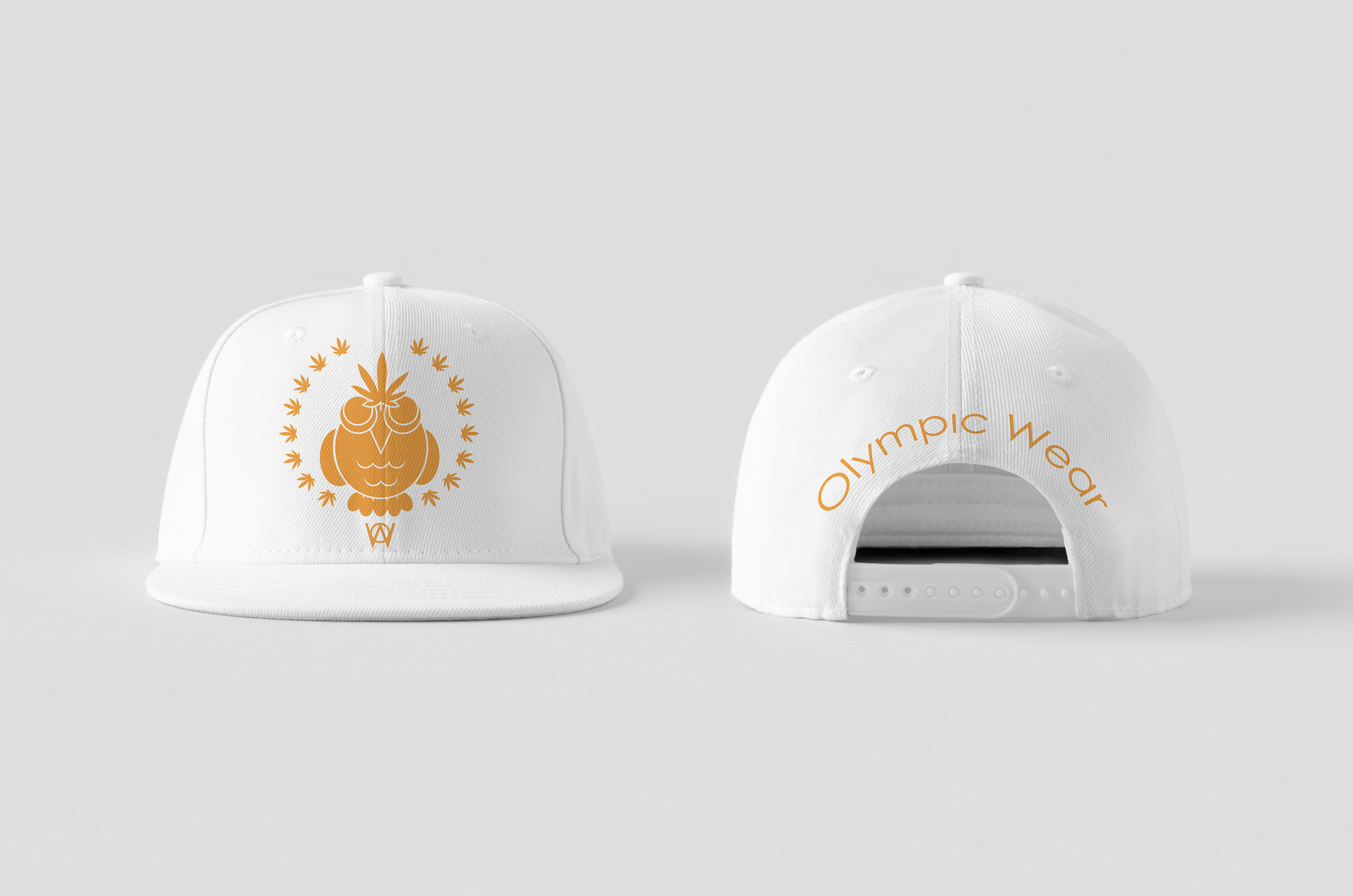
Olympic Wear Hat Mockup
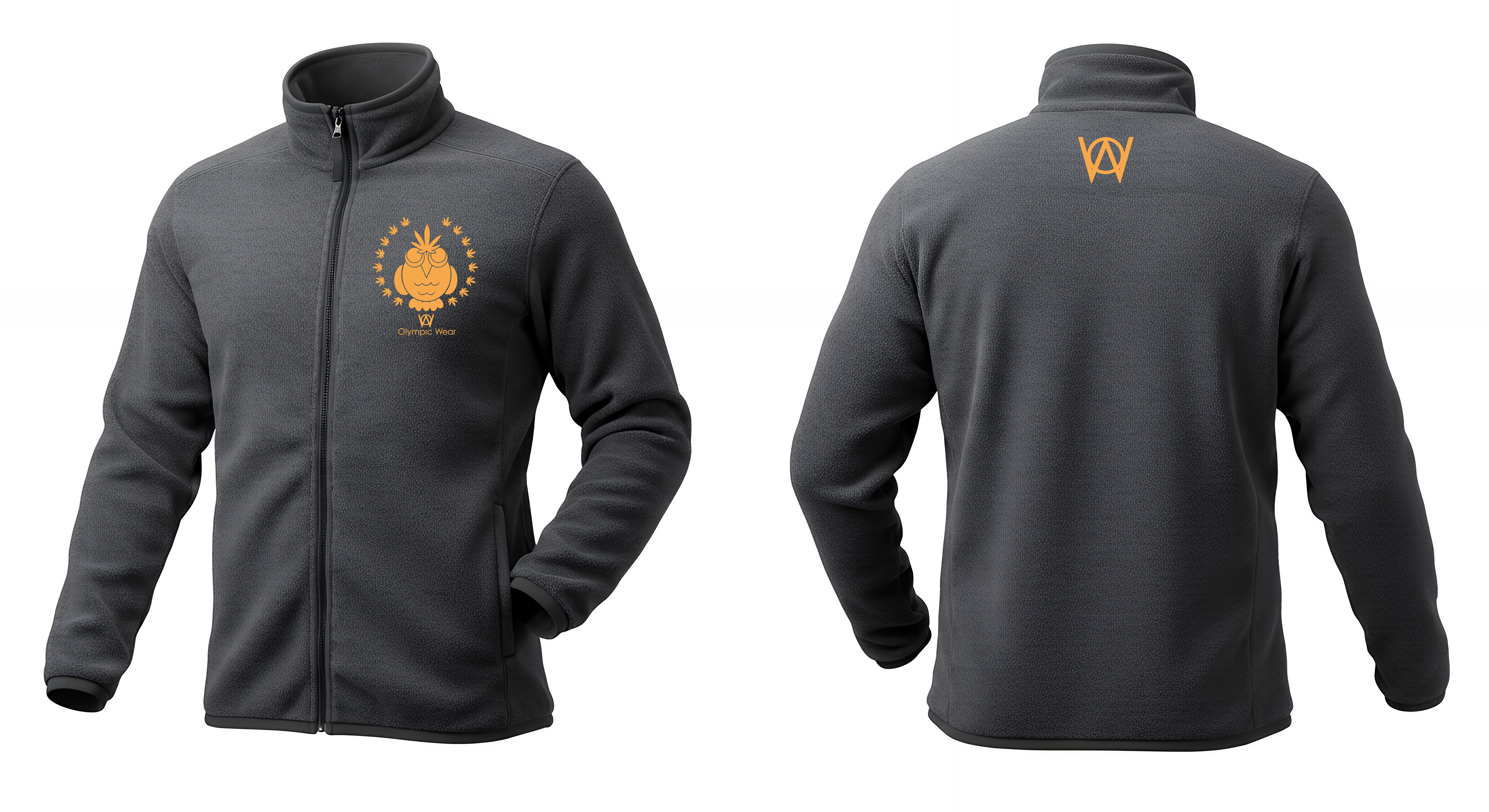
Olympic Wear Sweater Mockup
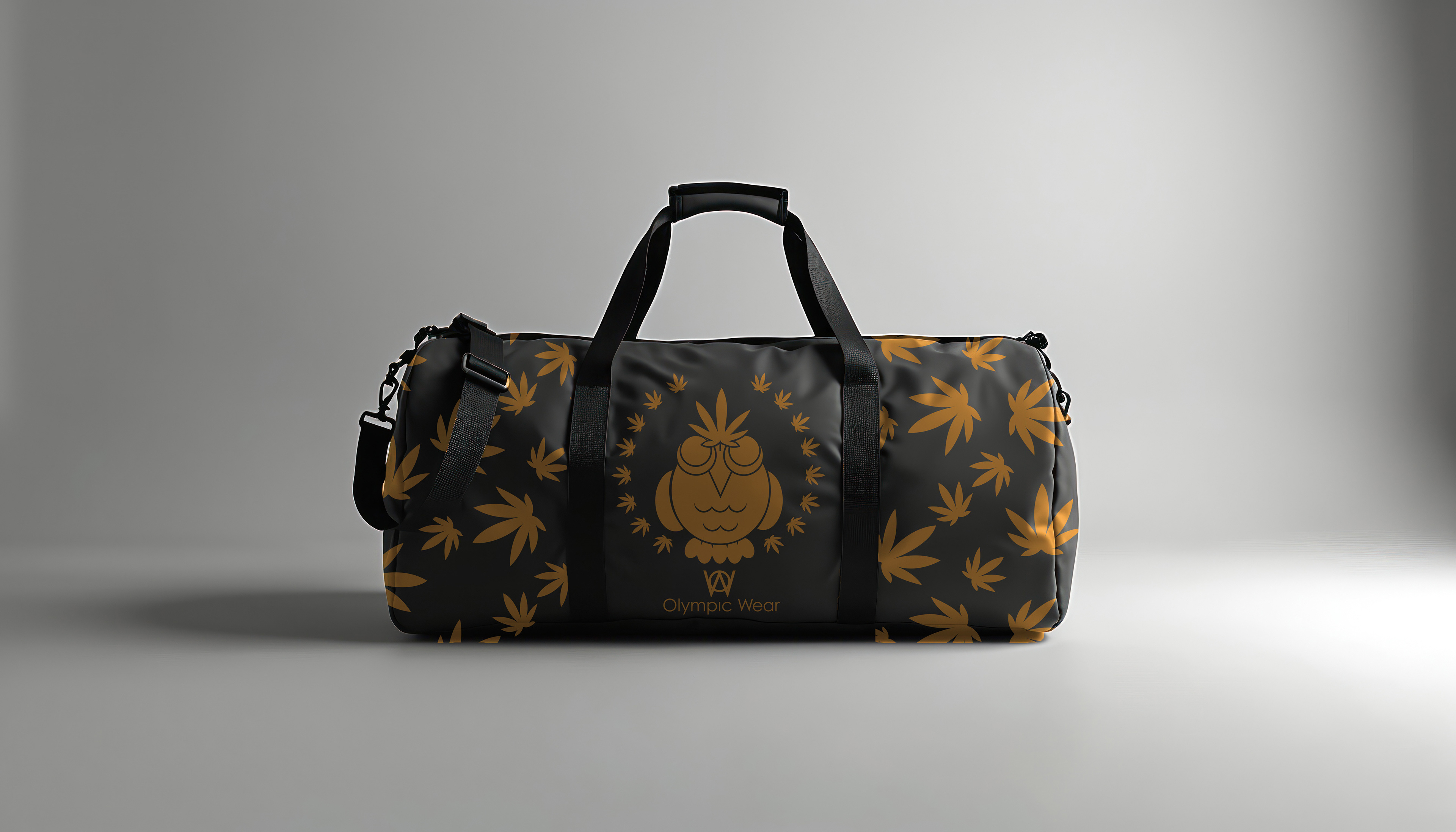
Olympic Wear Duffel Bag Mockup

Olympic Wear Sport Bra Mockup
Olympic Wear
For the Hemp brand project, I developed Olympic Wear, an elevated sportswear concept that merges sustainability, performance, and classical inspiration. Designed to challenge industry norms, Olympic Wear reimagines athletic apparel through the use of organic hemp fiber, offering a natural alternative to the synthetic materials commonly used by major sports brands. Hemp’s durability, breathability, moisture-wicking ability, and natural insulation make it ideal for intense training, while also significantly reducing environmental impact. The brand positions sustainability not as a trend, but as a standard for the future of performance wear. Inspired by the spirit of the ancient Olympic Games in Ancient Greece, the concept draws from mythology to reinforce its identity. In particular, Athena, goddess of wisdom, strategy, and craftsmanship, serves as a symbolic foundation. She represents both mental and physical discipline, qualities essential to athletes striving for excellence. The logo integrates an olive branch intertwined with a hemp leaf, symbolizing victory, peace, and sustainability. A reimagined owl, Athena’s sacred emblem, features hemp-inspired feather detailing to reinforce the eco-conscious narrative. Olympic Wear is more than apparel; it is performance gear rooted in heritage and innovation. Olympic Wear, Clothing for the Gods.
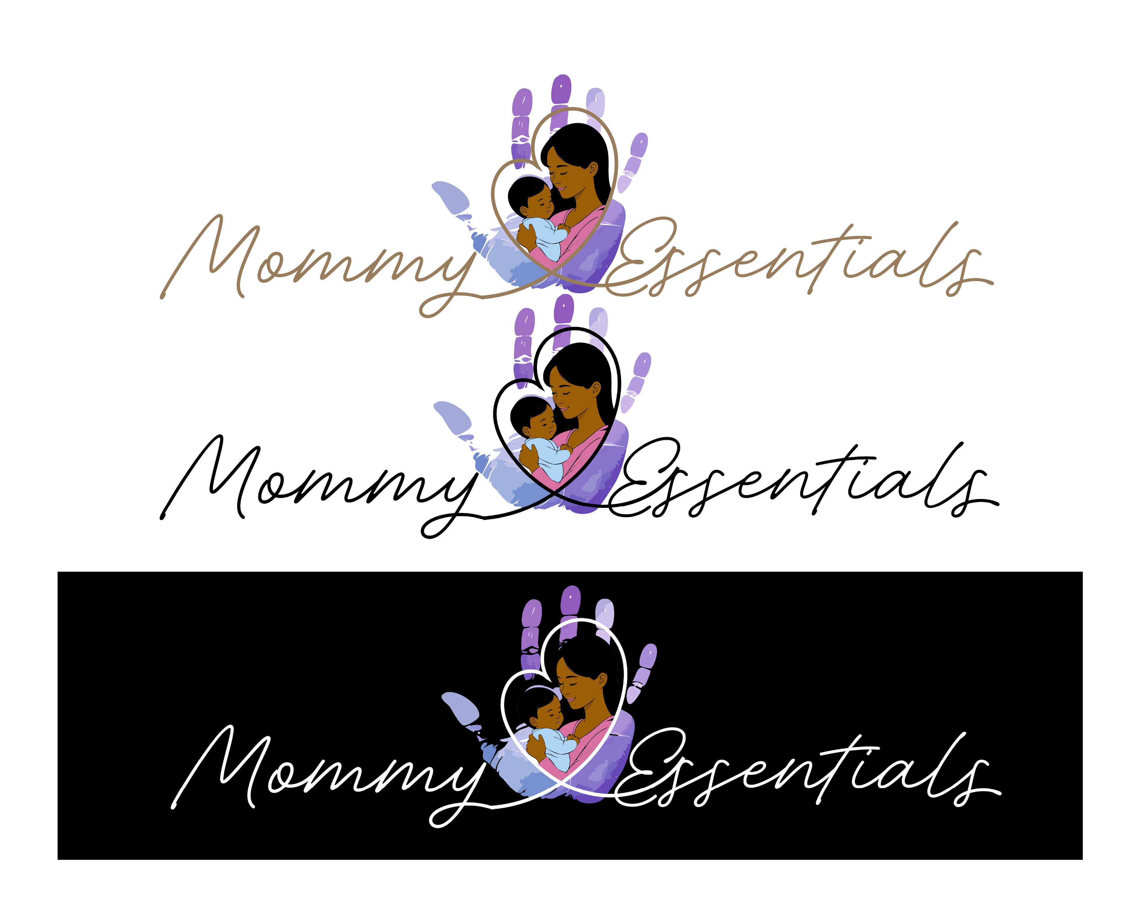
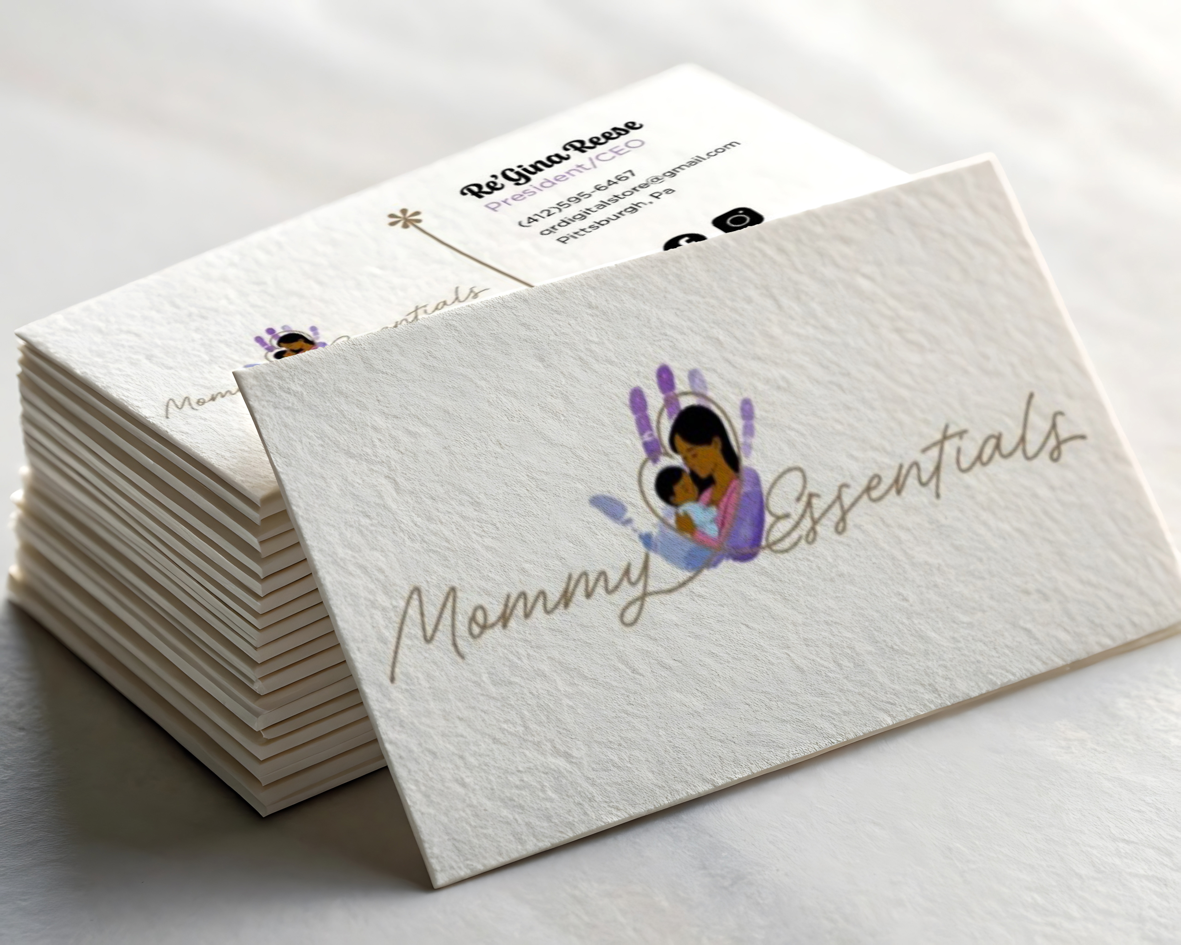
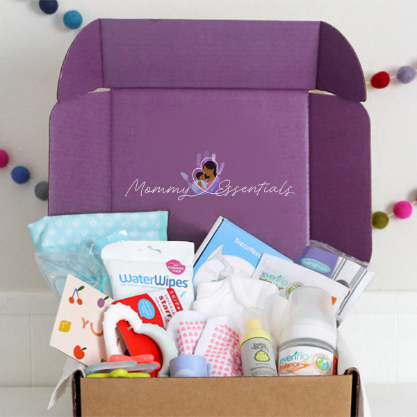
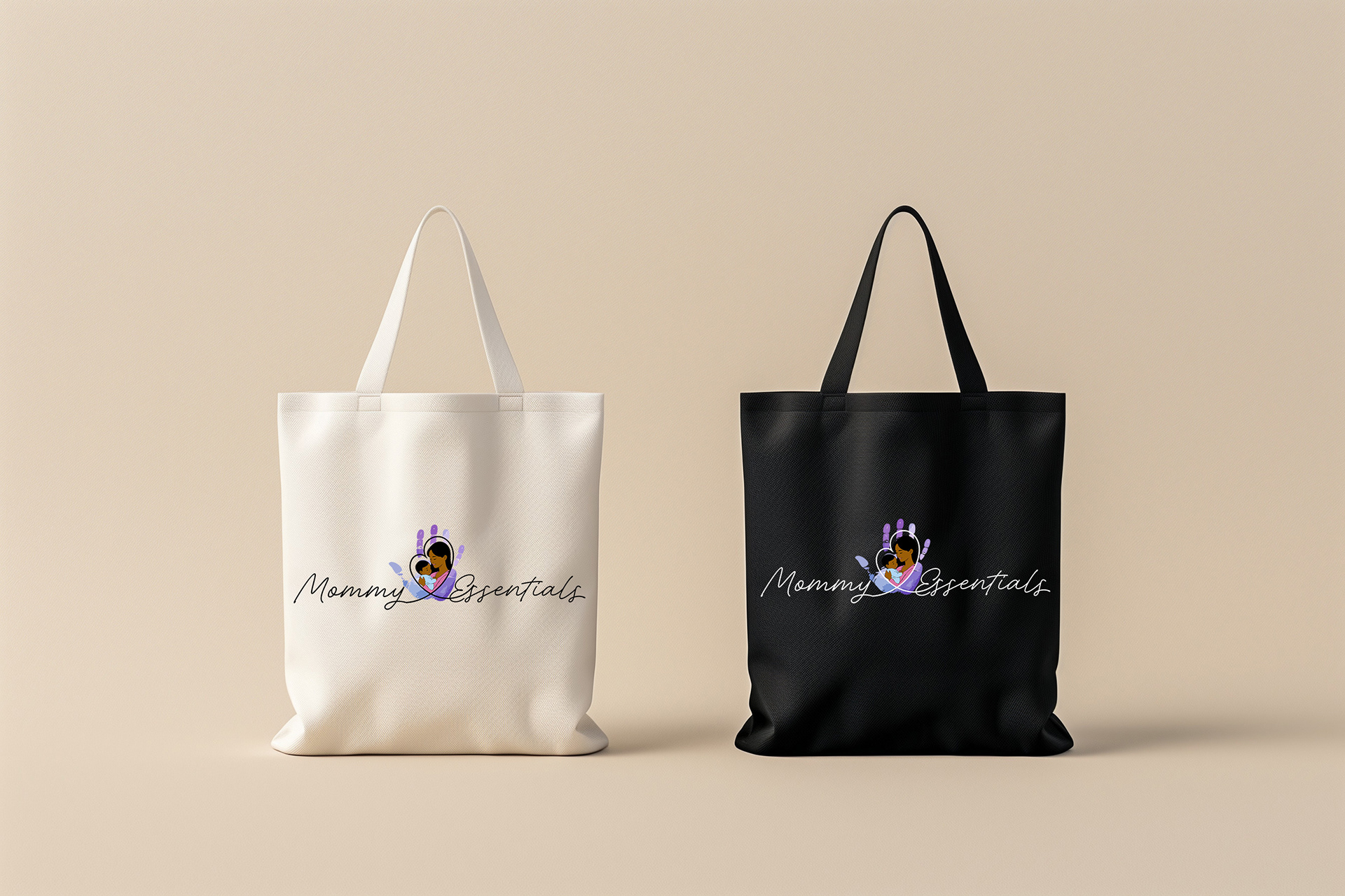
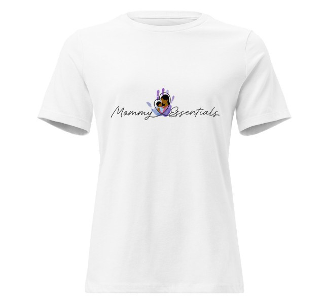
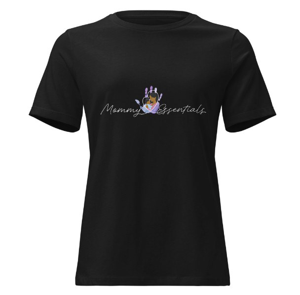
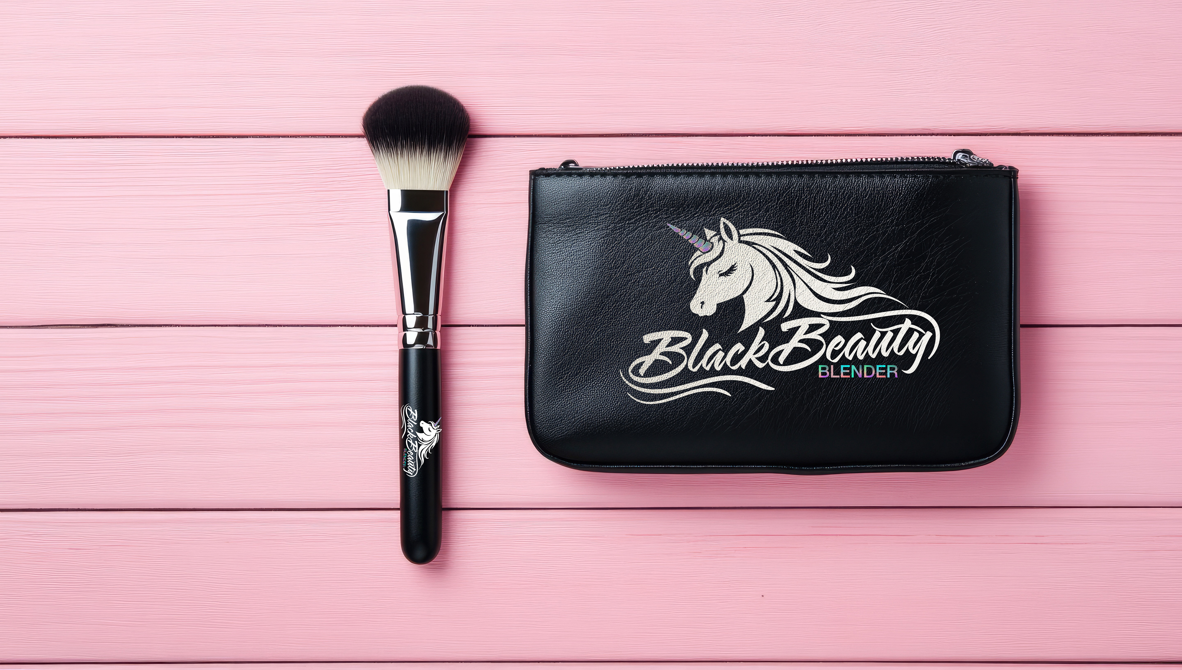
Mommy Essentials
Mommy Essentials is more than a marketing brand, it is a heartfelt tribute to motherhood, resilience, and the quiet strength found in everyday care. Created with intention and cultural significance, the brand centers on celebrating and supporting mothers through every stage of their journey. At its core, Mommy Essentials recognizes that motherhood is transformative, powerful, and deserving of both visibility and respect. The logo serves as a visual narrative of that mission. A handprint symbolizes the helping hand every mother deserves. Support during moments of change, growth, and vulnerability. It represents community, guidance, and reassurance. The flowing cursive typography introduces softness and elegance, honoring the grace mothers carry even when faced with challenges. This balance between strength and delicacy reflects the dual nature of motherhood itself. At the heart of the design is the image of a Black mother holding her baby, a powerful symbol of love, resilience, and generational legacy. This imagery intentionally centers Black motherhood, celebrating its beauty and strength while acknowledging its unique cultural depth. Mommy Essentials exists to uplift and empower moms by providing products that are affordable, convenient, and reliable. Ensuring that care, dignity, and support are always within reach.
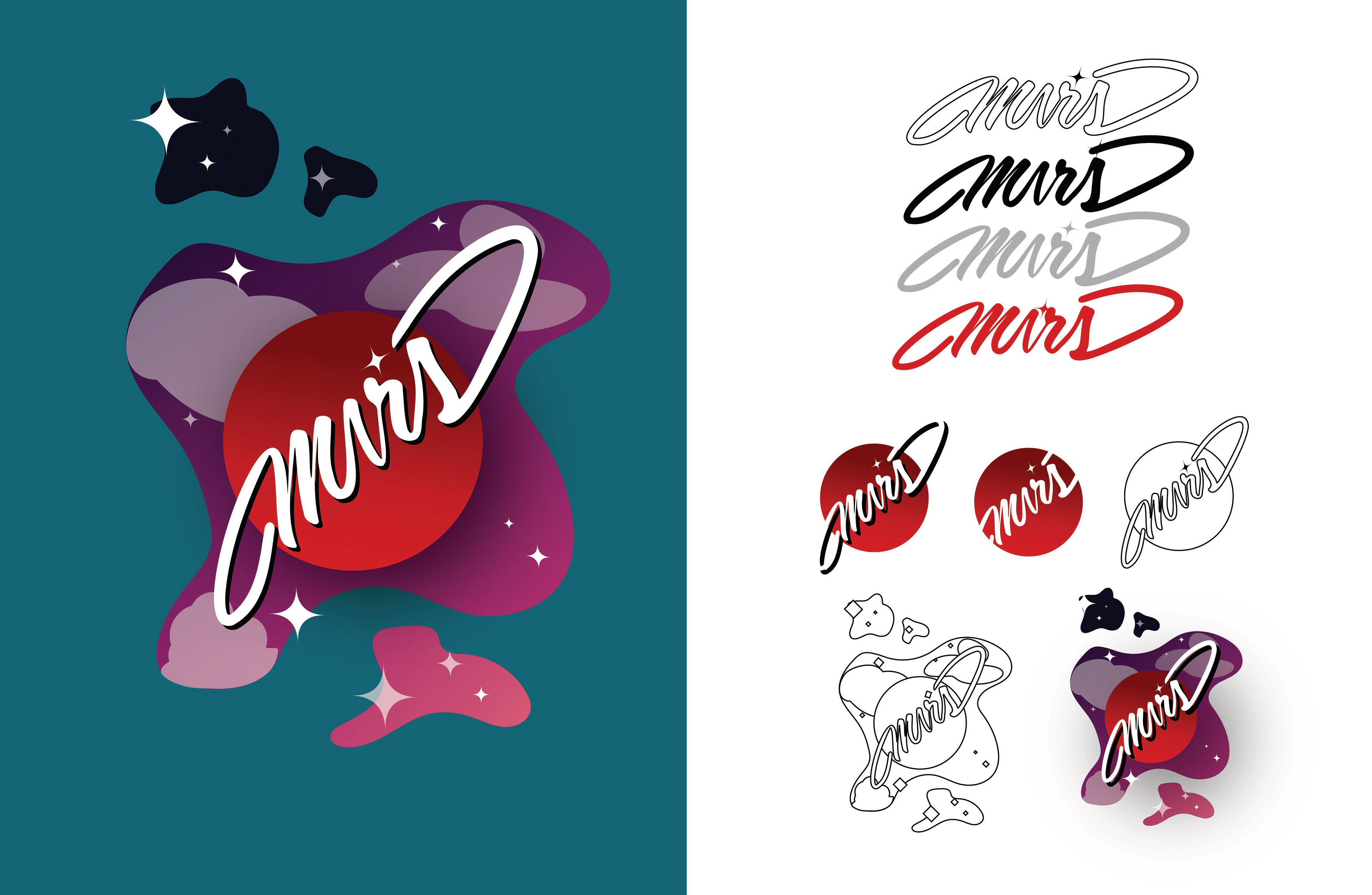
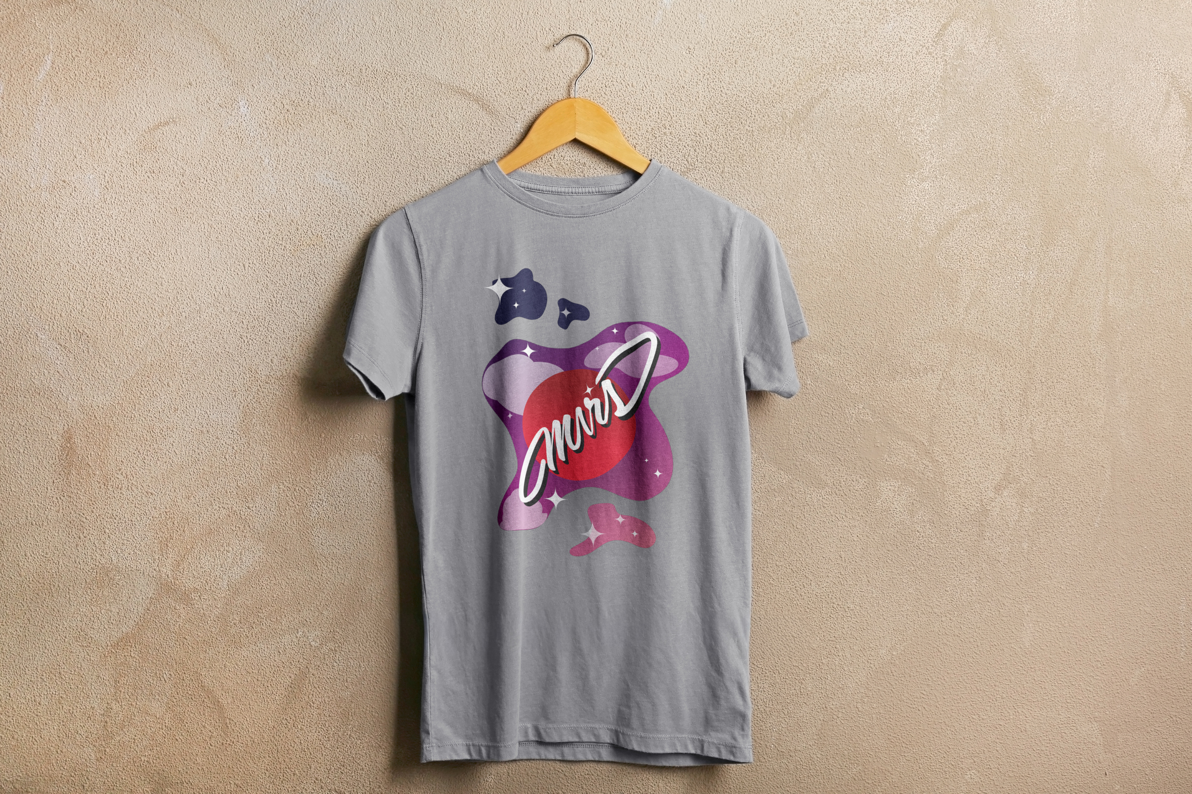
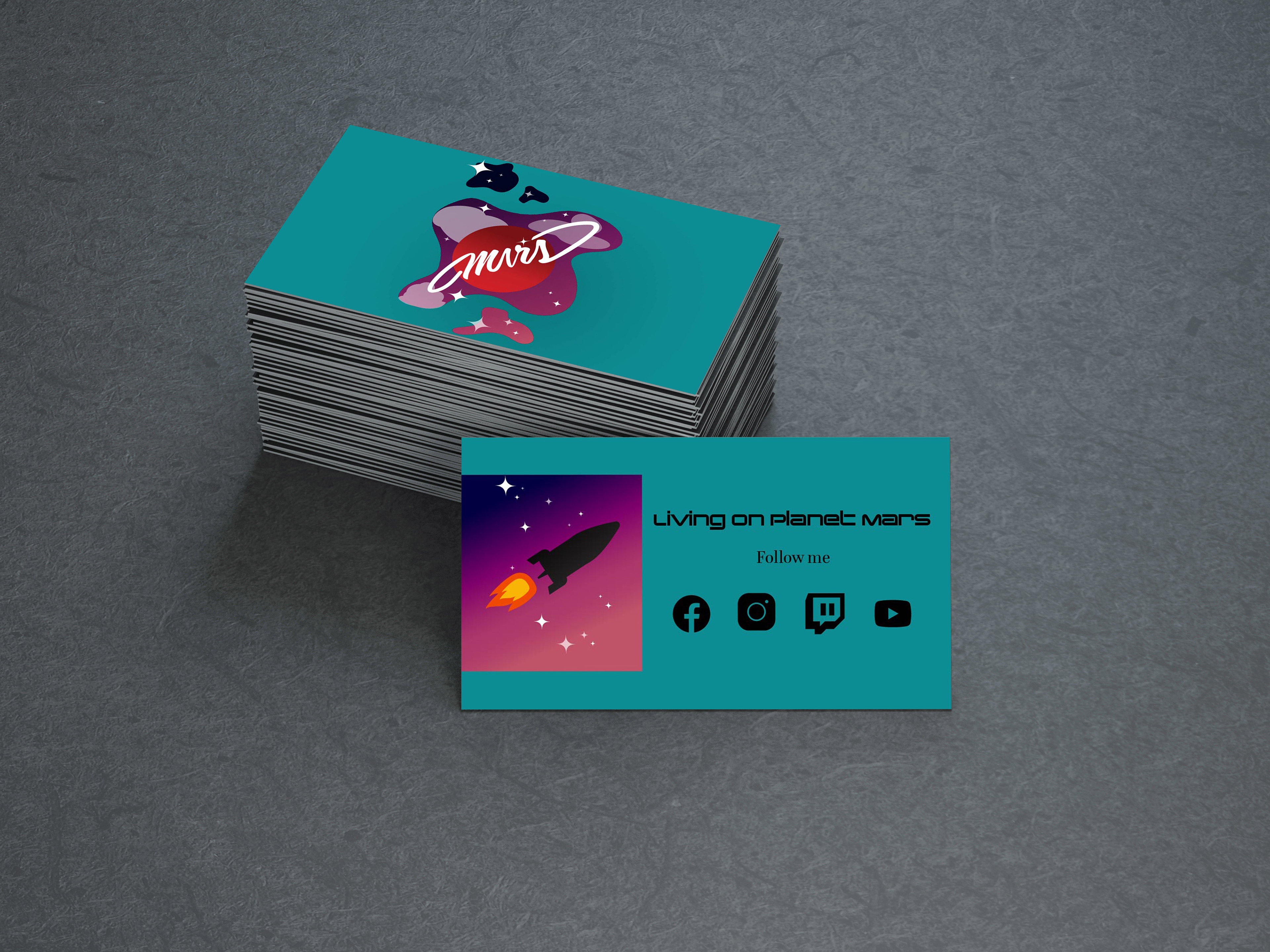
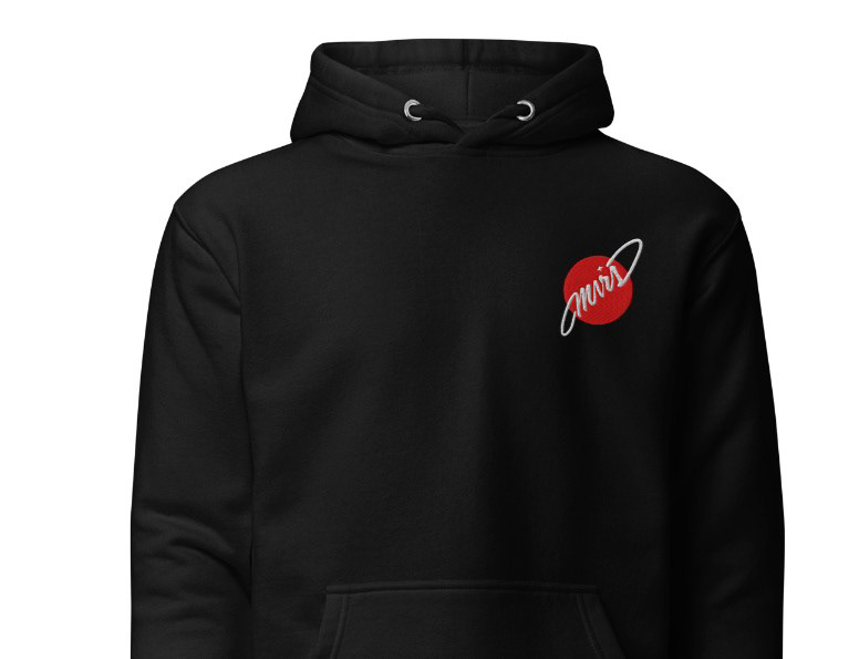
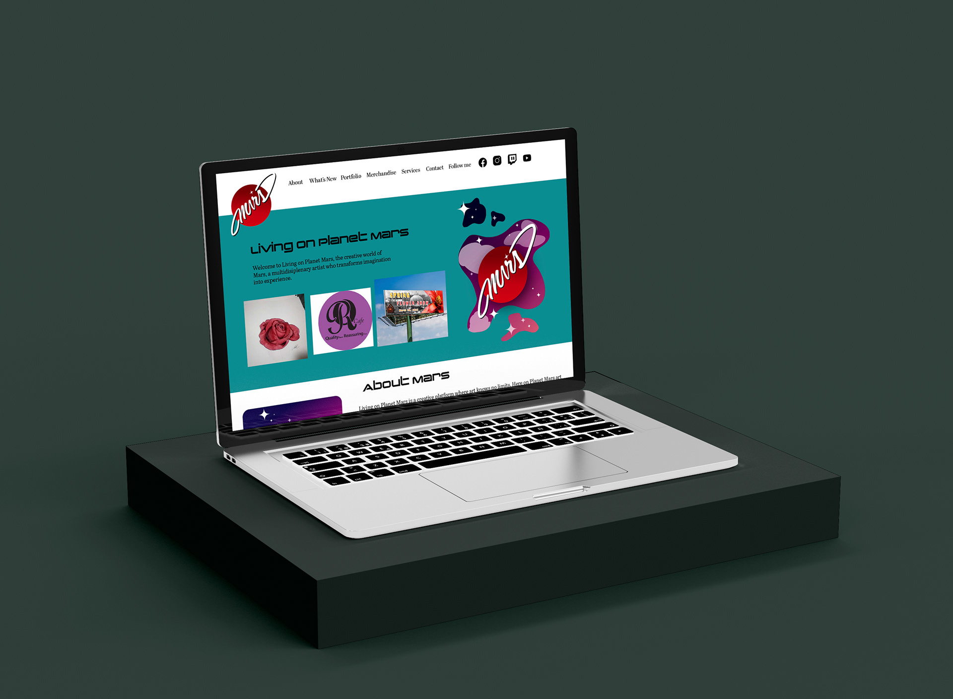
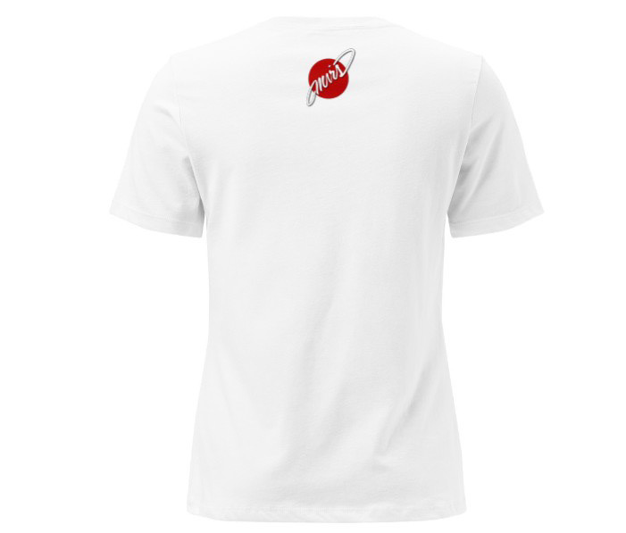
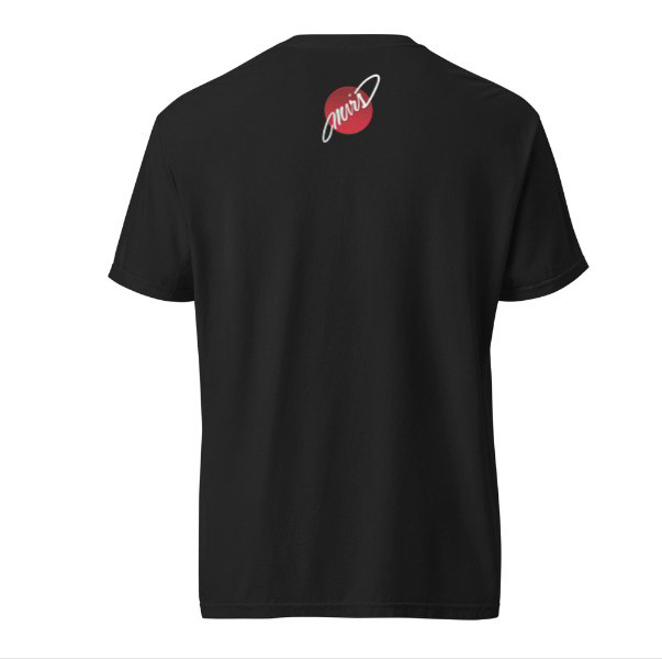
Living on Planet Mars
Living on Planet Mars is my personal creative brand and multidisciplinary platform built on the belief that art should exist without boundaries. The name symbolizes a world beyond limitation, a space where imagination thrives, experimentation is encouraged, and ideas are free to evolve. “Planet Mars” represents stepping outside the ordinary and creating from a place that feels limitless, bold, and visionary. As a creative platform, Living on Planet Mars spans multiple mediums, including traditional illustration, digital design, photography, and video editing. Rather than confining my work to a single style or format, the brand embraces versatility. Each project is approached with intention, ensuring the result is not only visually striking but also meaningful and communicative. The goal is to create work that resonates, tells a story, and leaves a lasting impression. For clients, Living on Planet Mars offers adaptable creative solutions. Whether developing brand visuals, producing original artistic concepts, or exploring new media formats. It is a collaborative environment where ideas can grow organically and innovation leads the process. At its core, the brand is about connection: using art in all its forms to bridge imagination and reality. Living on Planet Mars is where creativity has no limits and where dreams take visual form.
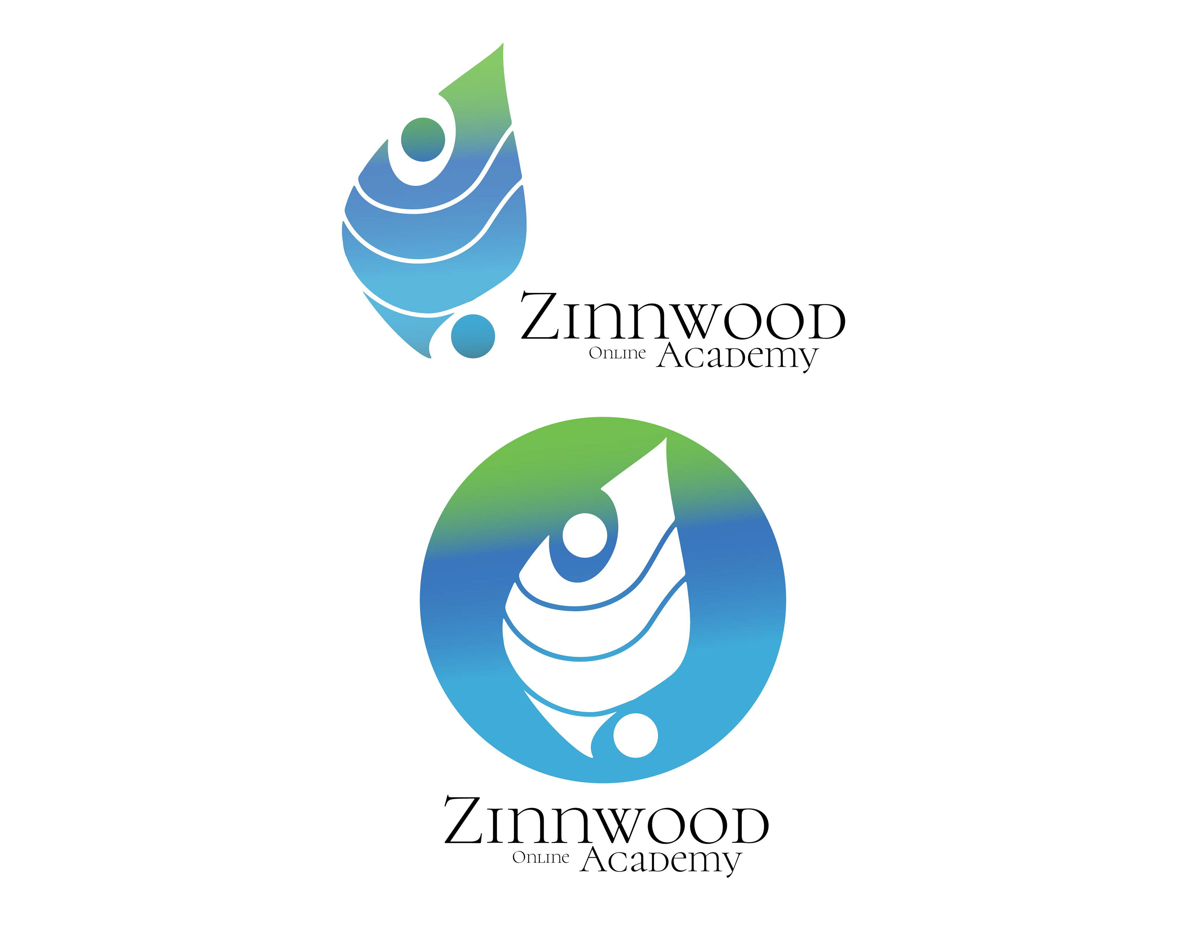
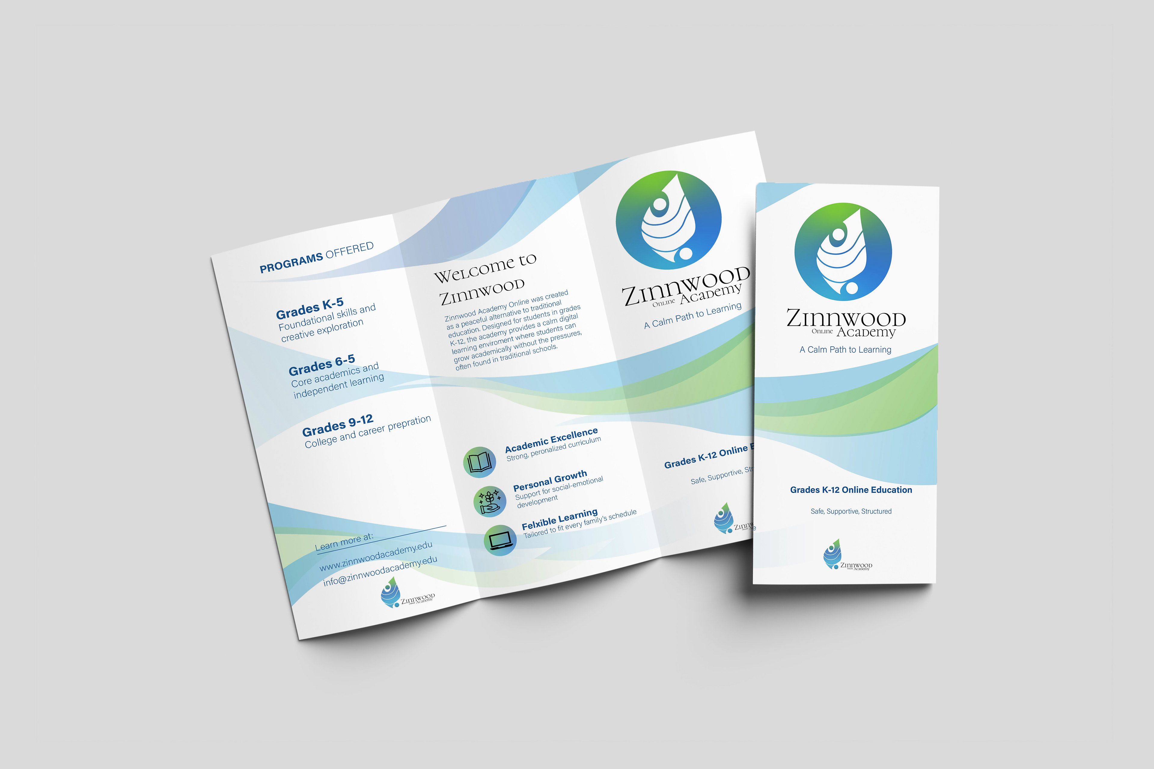

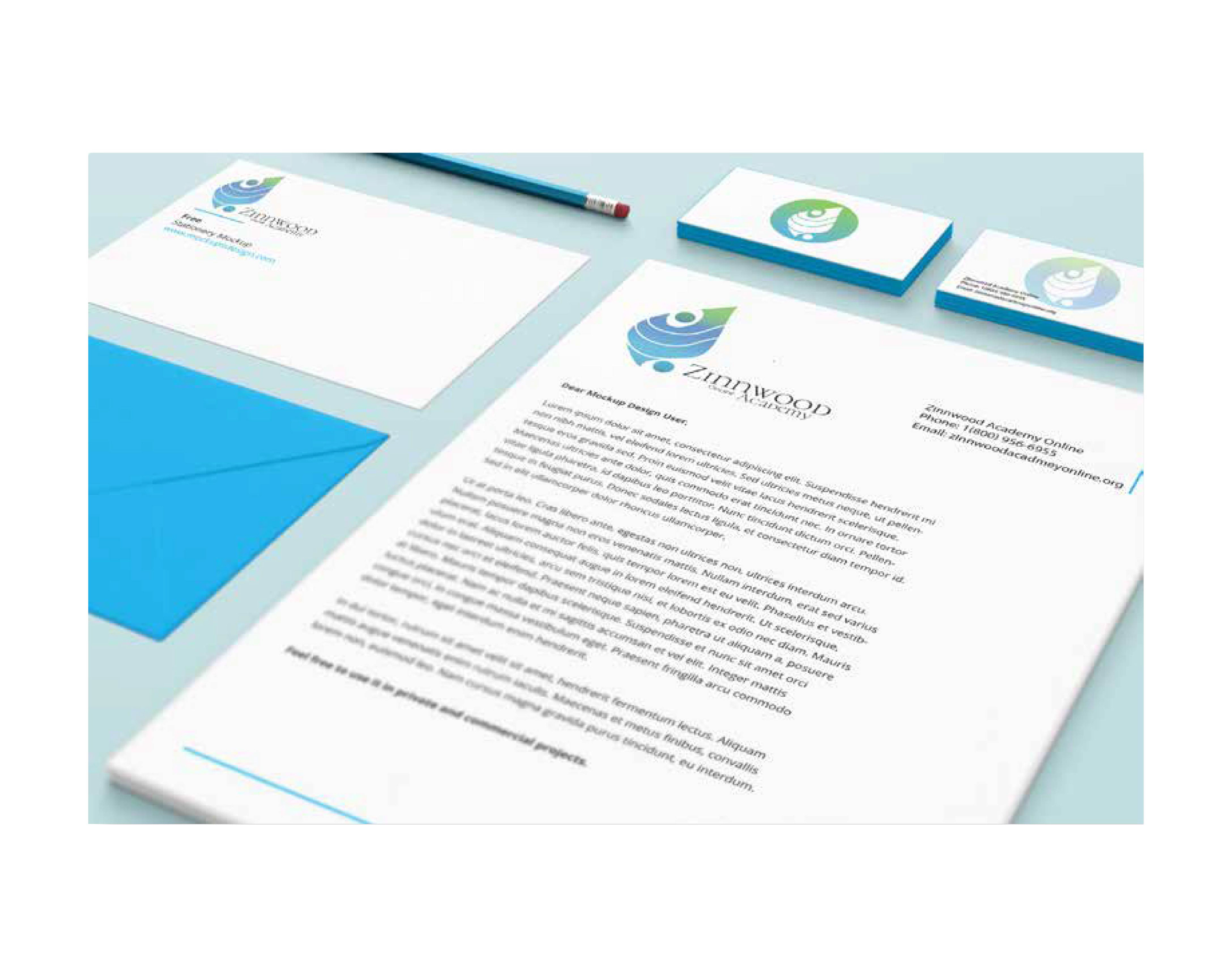
Zinnwood Academy Online
Zinnwood Academy Online was created as a safe, supportive, and calming alternative to traditional education. Designed for grades K–12, the academy provides families with a peaceful learning environment where students can grow academically without the pressures often found in public, private, or Catholic schools. The name Zinnwood is inspired by the feeling of calm and Zen, representing balance, clarity, and peace of mind for both students and parents. The brand identity reflects these values through soft gradients of blue and green, symbolizing trust, growth, and emotional wellbeing. The fluid, layered mark suggests protection and guidance while also forming an abstract figure that represents a student being supported. The circular version of the logo reinforces unity, safety, and wholeness, showing that every child is part of a secure learning community. Zinnwood Academy Online is especially committed to supporting students with special needs and those who may struggle in traditional school settings. It offers a bully free online space where children feel seen, heard, and respected. Academics are taken seriously, with structured programs that prepare students for future success while also recognizing that emotional support and individualized attention are just as important. This project focuses on creating more than just a school. It builds a trusted educational environment where parents can feel confident about their child’s future and students can thrive in a calm, structured, and compassionate setting.
Zinnwood Academy Online was created as a safe, supportive, and calming alternative to traditional education. Designed for grades K–12, the academy provides families with a peaceful learning environment where students can grow academically without the pressures often found in public, private, or Catholic schools. The name Zinnwood is inspired by the feeling of calm and Zen, representing balance, clarity, and peace of mind for both students and parents. The brand identity reflects these values through soft gradients of blue and green, symbolizing trust, growth, and emotional wellbeing. The fluid, layered mark suggests protection and guidance while also forming an abstract figure that represents a student being supported. The circular version of the logo reinforces unity, safety, and wholeness, showing that every child is part of a secure learning community. Zinnwood Academy Online is especially committed to supporting students with special needs and those who may struggle in traditional school settings. It offers a bully free online space where children feel seen, heard, and respected. Academics are taken seriously, with structured programs that prepare students for future success while also recognizing that emotional support and individualized attention are just as important. This project focuses on creating more than just a school. It builds a trusted educational environment where parents can feel confident about their child’s future and students can thrive in a calm, structured, and compassionate setting.